What Really Goes into a Logo?
What’s the first thing you think of when you imagine the perfect logo? Chances are Apple, Coca Cola or Nike come to mind. You’ve heard it again and again; a good logo should be simple and pleasing to the eye. However, when it comes to a great logo there’s more than meets the eye. There are a lot of research and design skills that go into creating the perfect logo. That’s why we sat down with our Head Graphic Designer Melissa to dissect what truly sets a logo apart.
When you first walk into the Lift Division office you may not immediately notice the tiny blonde working determinedly at her tall desk. However, this petite designer packs a big punch. With over five years of design experience, Melissa knows the ins and outs of creating successful design that remains timeless.
“I don't put anything out there that I'm not proud of. If I can't stand behind the design and fight for it, I don't have any right to even show it to the client.”
As the face of your business, your logo sets the tone for the perception of your entire company. Not only should a great designer catch the essence of your work, but they should also be able to research and identify the success of your competitions’. A lot of thought goes into a great logo, and sometimes Melissa will make 30+ logos and only end up sending the 3 strongest to the client.
“I look at any marketing materials, pictures I can find, reviews, articles and anything else pertaining to their business; and then I do the same for their competitors so I know what’s out there and what we're up against.”
One of the struggles for designers and customers alike is the overall vision for the finalized logo. It can be difficult for a customer to trust a designer when it comes to their business, something that is constantly on their mind. However, an experienced designer that has worked with countless clients will know what will suit your business and garner the most success.
A common problem can be a client with an overly set vision. Having an open mind to your graphic designer’s ideas is often the best idea for your company. It’s their job to fit a logo to your business that expresses and reinforces what you stand for. A great designer will know the ins and outs of your business, industry and the design world to make a timeless and fitting logo that will represent your business the way it should be.
So how exactly can you make this work for your own company? Lets take a look at some of the logos Lift Division has created in the past.
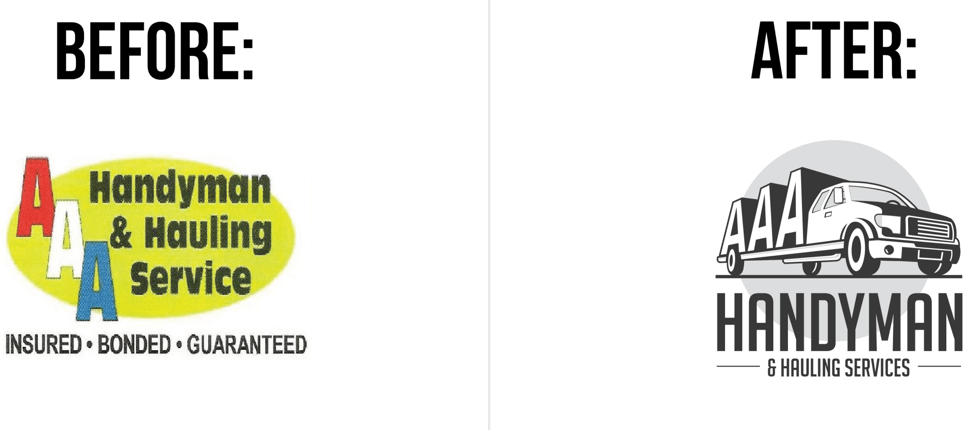
AAA Handyman and Hauling Service
Before: The logo AAA had before didn’t express the professionalism of their business. The fonts and colors of their logo didn’t translate well to black and white and it didn’t show the essence of their business.
After: The new logo is easily translatable and is easy to read. Meaning is added to the logo, making it more memorable to the customers who see it. The truck hauling heavily outlined “AAA” shows how their business can haul objects of all sizes.
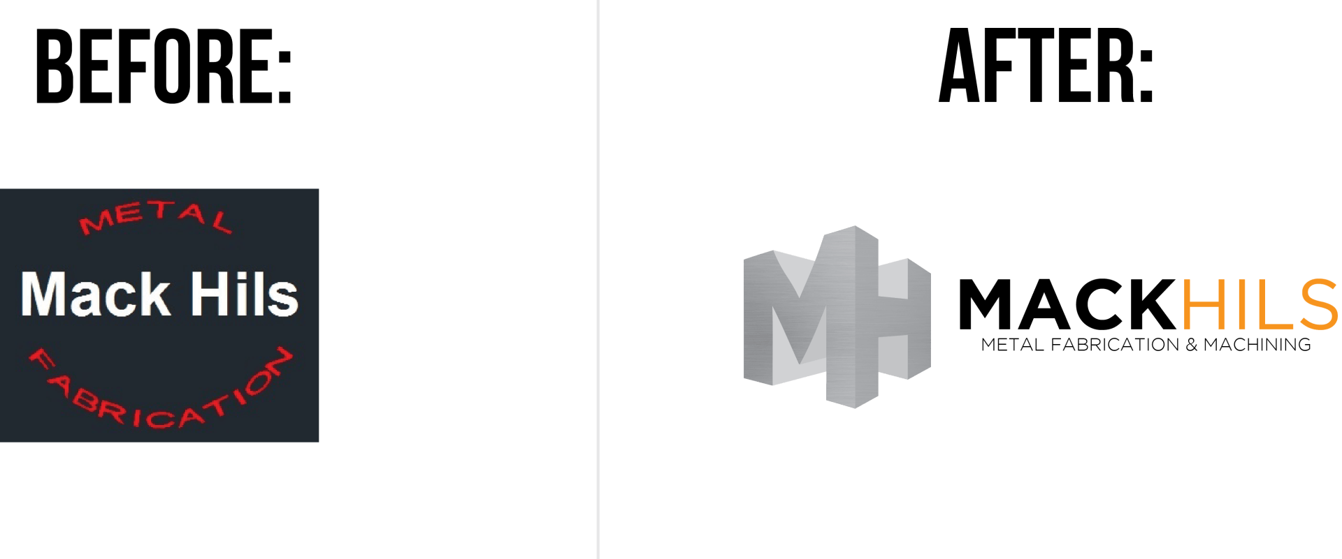
Mack Hils
Before: The fonts on this logo were difficult to read, particularly the red font against the blue background that read “metal fabrication.” The logo didn’t grab potential customer’s eyes and was easily looked over when trying to find a respectable metal company.
After: The “MH” is impossible to miss. Not to mention, we have incorporated bold color in a different way, using orange to differentiate between “Mack” and “Hils” and speaking to the building and construction industry. The metal finish in the “MH” now reflects the high-end metal work that Mack Hils does for their customers. The new logo is now easy to read and professional.
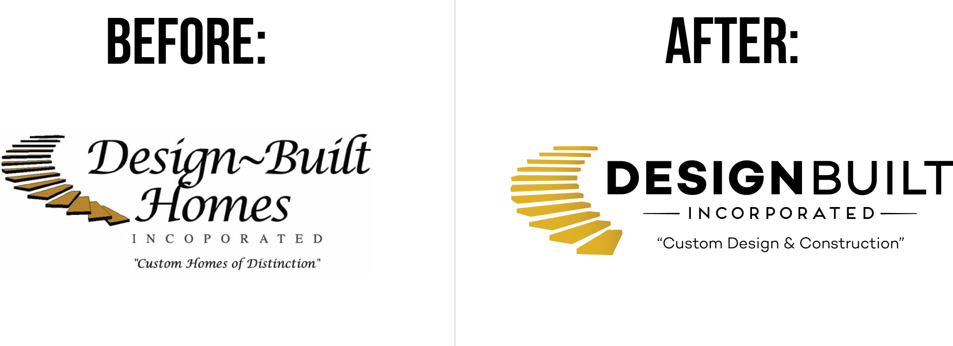
Design Build Homes
Before: With heavily outlined stairs and mismatched script fonts, Design Built homes needed a renovation. While their motto was “Custom homes of distinction,” their logo hardly stood out at all. The stairs were a great symbol for their business, but were being presented in the wrong way.
After: Design Built Homes, Inc. was just looking to update their logo to a more memorable and timeless design. In order to create a logo that reflected the distinction of their work, the logo for Design Build Homes was made cleaner and more modern. By simplifying the stairs and utilizing negative space, our designers insured that both the emblem and font stood out much more than before. The clean set of yellow stairs now still symbolizes “distinction,” however now that distinction is one of modern and quality work.
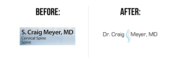
Dr. Craig Meyer
Before: With only a simple font as the logo, Dr. Meyer’s design fell flat. It was plain and forgettable amongst a sea of doctor’s logos in a field where you need to stand out. The logo wasn’t living up to the Dr. Meyer’s reputation as a spinal surgeon.
After: The logo is clean and simple, but still interesting. The techy style of font speaks to his knowledge of the newest technologies. It becomes easily understood that he is a spine surgeon without physically writing in the logo.
A great logo consists of meaning, visual appeal and timelessness. However, picking a great designer will ensure this for you. A fantastic designer is also a great researcher, and will spend the time to make sure that your logo ends up becoming the perfect representation of you and your business.
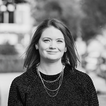
Originally from Louisville, Kentucky, Sarah had an interest in art, writing and technology from a very early age. She spent her childhood building websites and designing album artwork. Fortunate enough to attend a high school that offered graphic design classes, she was able to pursue her passion and expertise earlier than most of her peers.
Sarah oversees all operational and visual aspects of Lift Division, including design, community management, photography, videography, recruitment and company initiatives. With over 15 years of experience in marketing, Sarah has been instrumental in the high growth of multiple companies and brands, which included helping a company flourish from a $10M to $45M company. She innovates, leads and executes strategic marketing initiatives from the ground up.
Sarah has held various marketing and design positions including Brake Printing, Missouri Consolidated Health Care Plan, Westminster College and Fresh Ideas Food Service as the Director of Marketing. Her career has allowed her to innovate, lead and execute strategic marketing initiatives from the ground up while managing a team of digital marketers. Sarah has managed and developed marketing, communication, branding, digital communities and creative direction for various companies throughout her career.

GET A FREE ONLINE MARKETING ASSESSMENT!
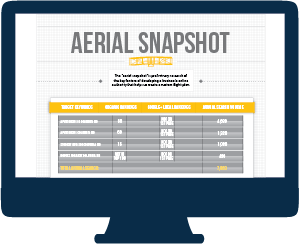
Our FREE Aerial Snapshot will:
- Identify Valuable Keywords & Your Current Rankings
- Analyze Your Current Local Presence
- Review Key Performance Indicators on Your Website
- Assess Your Social Media Profiles
- Provide You with a Reputation Analysis