Logo Design
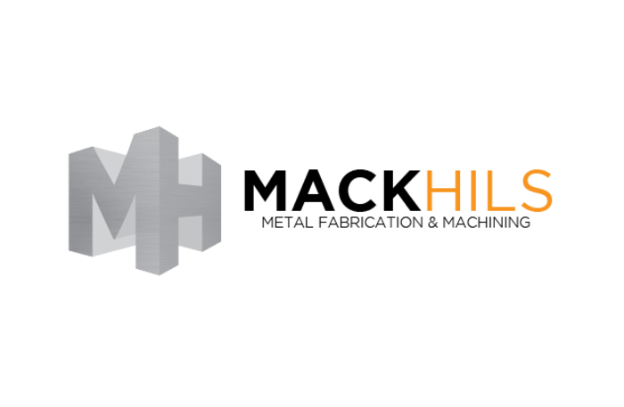
MackHils Metal Fabrication & Machining
Mack Hils is a metal fabrication and machining company based out of Moberly, Mo. They weren’t satisfied with their previous logo and wanted one that would better communicate their brand and allude to the services they offer.
The three-dimensional metallic structure showcases the dynamic range and complexity of their business, while the juxtaposed typography serves to represent a brand that is both bold and refined.
Button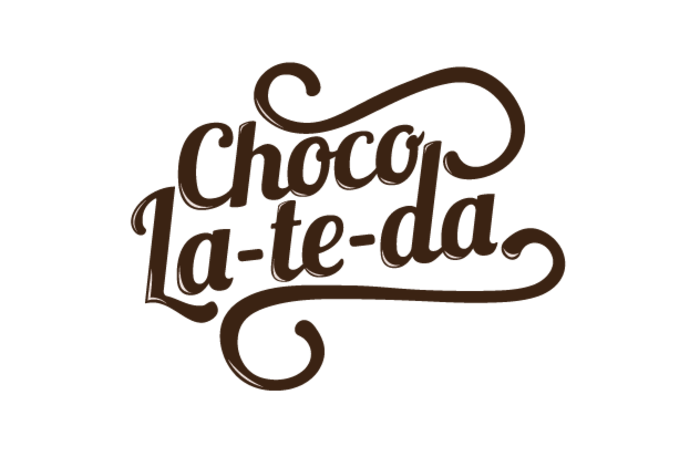
Chocola-te-da
Chocola-te-da was an idea for a modern, gourmet candy company branded in a nostalgic '50s era style. We equipped them with a classy logo that emphasizes the jubilance, elegance, and timelessness of post-war culture.
Our designers approached this retrospective concept with verve, employing a rich typeface that projected a '50s era feel and alluded to the fanciful chocolates they serve.
Button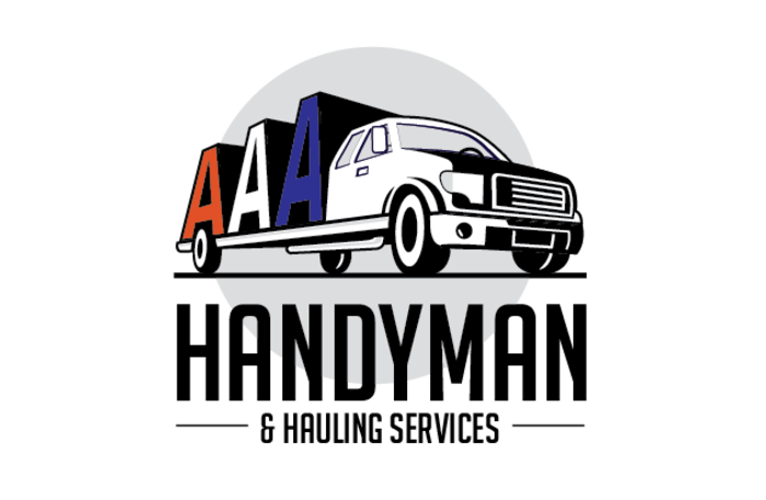
AAA Handyman
AAA Handyman is a multifaceted service company based out of Jefferson City, Mo, focusing on home improvement, construction and hauling. They needed a brand image and turned to us for a logo that would communicate their company and the services they offer.
Our designers incorporated a flatbed truck to depict their services and employed a red, white, and blue color scheme to symbolize American values such as a strong work ethic and reliability.
Button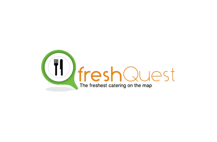
freshQuest
freshQuest was an idea for an organic, locally-sourced catering business that emphasized convenience and originality through a web-based booking service.
We created a logo for them that features natural colors and contrasting typefaces, fostering a uniquely appealing aesthetic. The end result conveys simplicity, healthfulness, and interactive communication — representing the three central components of their brand image.
Button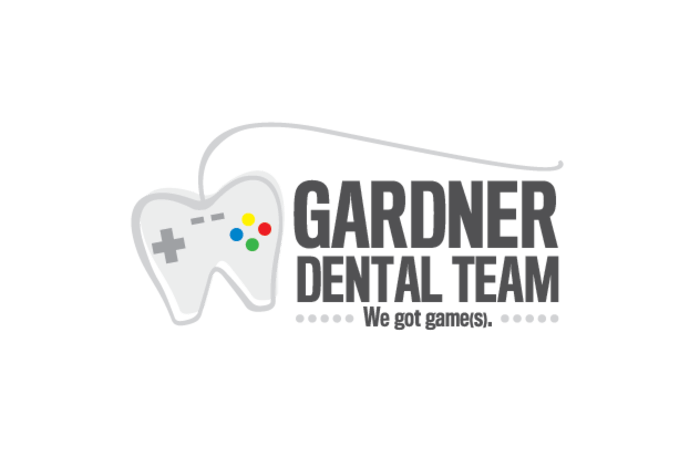
Gardner Dental Team
The Gardner Dental Team is a group of pediatric dentists operating out of Columbia, Mo. Their online presence was in need of a serious upgrade, so we equipped them with a fresh website and new logo.
Taking an unconventional approach with their logo, our graphic design team alluded to the inviting aspect of video games in their lobby. Gardner's vision was to portray their pediatric practice as welcoming and fun for children who are commonly averse to visiting the dentist.
Button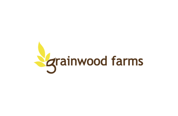
Grainwood Farms
Grainwood Farms was an idea for a cereal company that provided healthful, whole-wheat breakfast cereals under a modern brand image.
Our designers equipped Grainwood Farms with a logo that utilized only two core, purposeful colors: gold for the grains they produce, and black for clarity and modernity. Ultimately, their logo conveys the two main features of their brand in a fashion that’s all at once creative, simplistic, and visually appealing.
Button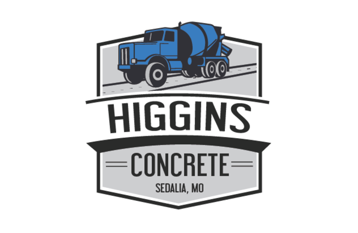
Higgins Concrete
Higgins Concrete is a concrete contracting company based in Sedalia, Mo. They recognized that independent contractors often lack a strong brand identity, and wanted a new logo to set them apart from their competition.
The logo we produced centered on the services they offer and the character of their company. Featuring a bold, blue concrete mixer and prominent typography, the final design symbolizes dependability and customer satisfaction.
Button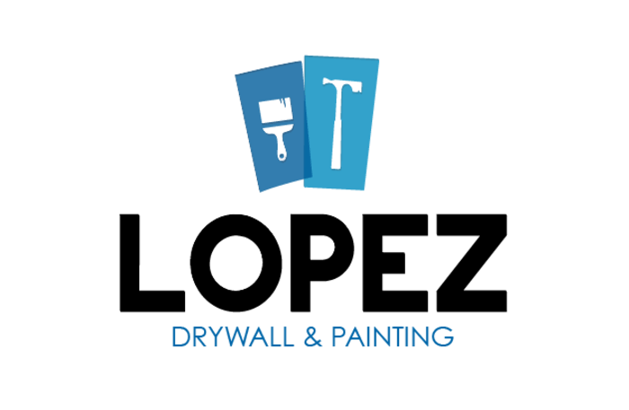
Lopez Drywall & Painting
Lopez Drywall & Painting is a home interior renovation company based in Columbia, Mo. They came to us needing a logo, web presence and overall brand identity.
Lopez Drywall had no clear, creative vision for their company; incorporating hardware elements, complementary shaded backdrops and jutting typography, our graphic design team created a logo that communicates their services with a simple, yet expressive layout.
Button
OneMissouri.com
OneMissouri.com is a lifestyle blog focusing on local eateries, bars and businesses, all within the unique cultures of Columbia, Mo. They came to us with an entrepreneurial mindset, but they lacked direction; we helped them brand their blog from the start with an imaginative and purposeful logo.
Incorporating brackets and subtle typographical elements, the logo represents prominence and playfulness, complementing the consumer based platform.
Button
Rvw.Us
Review Us is a dynamic business review platform that leads traffic to specific review pages, increasing efficiency and bringing convenience to the review process. Although the interface is still in development, they turned to us to provide them with a logo, website and consistent brand identity.
With contrasting blue and yellow typefaces, we designed a welcoming logo that demonstrates individuality and membership to an interactive, transparent reviewing community.
Button
Sunflower Hills
Sunflower Hills was an idea for a family-owned vineyard based out of Oregon. Looking to establish their business and build a strong client base, we helped brand Sunflower Hills with a modern logo.
The new logo captures the look and feel of a rural Oregon vineyard, while also portraying a vibrant and playful company culture.
Button
GET A FREE ONLINE MARKETING ASSESSMENT!
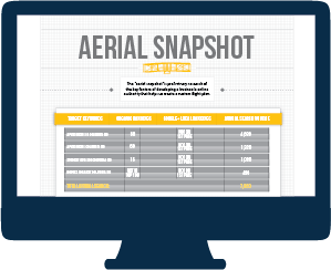
Our FREE Aerial Snapshot will:
- Identify Valuable Keywords & Your Current Rankings
- Analyze Your Current Local Presence
- Review Key Performance Indicators on Your Website
- Assess Your Social Media Profiles
- Provide You with a Reputation Analysis
Contact Us
We will get back to you as soon as possible.
Please try again later.
All Rights Reserved | Lift Division | 573-445-0658